Hi all.
I have been away for awhile, since April. Sorry for that. I will be posting some new material soon. Until then enjoy your summer.
John

Monday, July 9, 2012
Tuesday, April 17, 2012
Illustration Friday Pieces
Good day all. I have been working on Illustration Friday pieces off and on for the last couple months. I haven't really stayed with one style or another as I've been using these to explore different styles and techniques.
For the first word, Grounded, I was actually showing my children how to use basic shapes and the illustration just kinda happened.

The second word I did work for was, Prepared. For this piece I decided to try my hand at doing a 3 panel comic style page. Things were progressing well and then someone broke into my truck and did a bunch of damage, I got side tracked with repairs, insurance and police reports and I have not made it back to this piece yet. Here is where I left it.
Thumb nails

work in progress
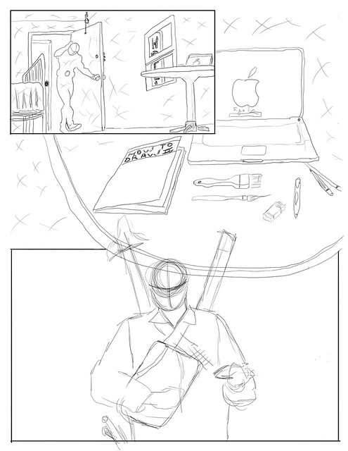
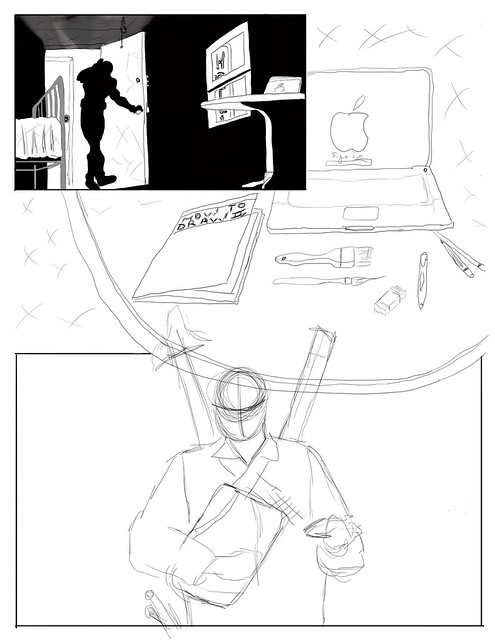

As you can see there is still a fair amount of work to be done and I plan on getting back to it after I finish up my final exams.
For the word, Forward, I wanted to give a graphic style a go. I worked with coloured pencils and graphite. There is four elements to this illustration and all of them come back to moving forward.
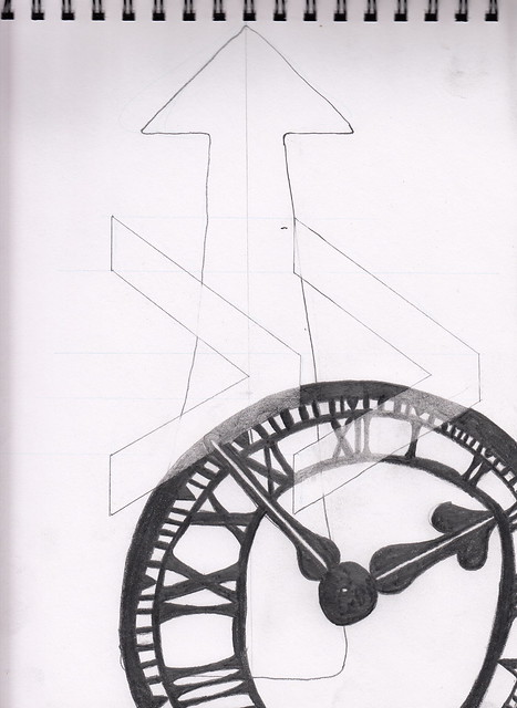
A clock, because time is always moving forward, and never seems to leave us enough.
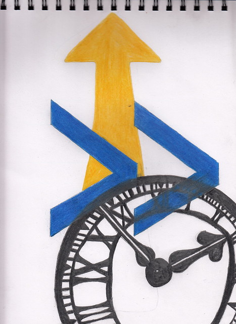
The blue arrows are from the fast forward buttons on most electronics and the yellow arrow is always the one we follow while driving.
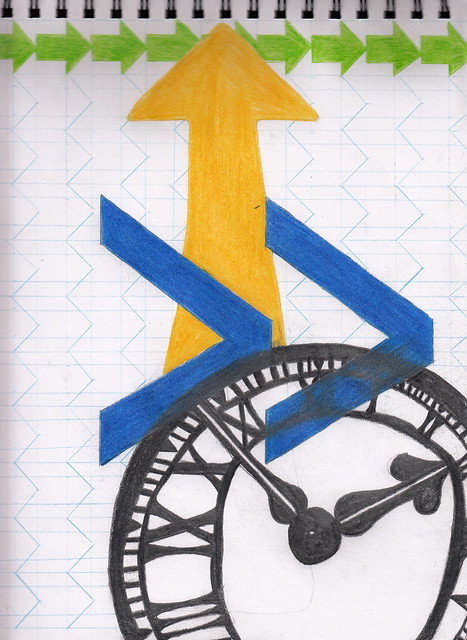
The little green arrows are seen everywhere to direct us where to go. Weather in a mall, library or school, really any major public venue, these arrows are what we follow.
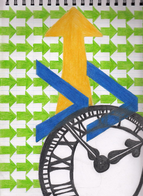
Here at the finished illustration you can see that the negative space is arrows going in the opposite direction. This is to get you thinking, is there a way to move backwards?
Ok for the word Capable, I'm interested in mixing my illustrations and photography to see weather I can develop a style of my own. This is just me playing around with an older drawing, of Emma Frost from the Marvel Universe, scanned clipped form the original file and brought into the landscape photo.

You can clearly see from this early trial that I have a lot of refining to do. But I am going to continue to explore the style concept, perhaps with some digital renderings and photography?
Digital rendering? This seems to be the way of things lately. So, I decided to do my illustration for Intent in this medium. When thinking about the word Intent the first thing that came to my mind was the Joker from Batman. This guy always has the most interesting intentions.

I started with some rough lines, shadows and some basic colours. The smile and rubber chicken are both iconic images associated with the Joker so I got these done early on.
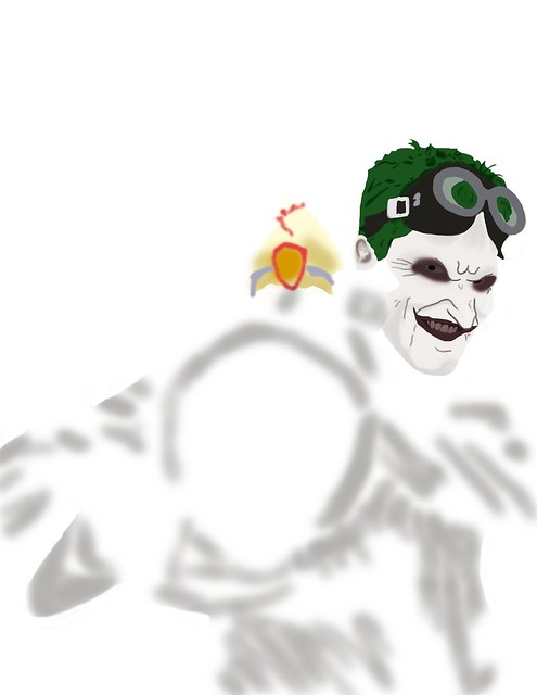
I worked on his head next, getting a feel for how much detail work I wanted in this illustration.
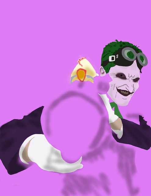
I dropped a solid colour background in just to allow myself a clear way of seeing where the white elements were lining up.

Once I had the white areas done I got rid of the background and got to work on his upper body and the bazooka.
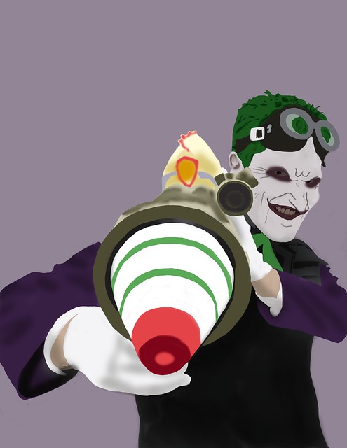
To finish it off I put in a more subtle back ground colour. I'm not sure I'm finished with this piece. I'm thinking of adding Harley in the background maybe peaking out from under his arm? I'm not sure? But for the word Intent I think this works well.
Well there you have it. This is where I'm at with my Illustration Friday pieces. I have concepts started for Vocal, Twirl and Popularity but they are not presentable at this time. I hope to have them underway by the end of the week, tomorrow, later today we will see how finals go.
Cheers
Johnathon
For the first word, Grounded, I was actually showing my children how to use basic shapes and the illustration just kinda happened.
The second word I did work for was, Prepared. For this piece I decided to try my hand at doing a 3 panel comic style page. Things were progressing well and then someone broke into my truck and did a bunch of damage, I got side tracked with repairs, insurance and police reports and I have not made it back to this piece yet. Here is where I left it.
Thumb nails
work in progress
As you can see there is still a fair amount of work to be done and I plan on getting back to it after I finish up my final exams.
For the word, Forward, I wanted to give a graphic style a go. I worked with coloured pencils and graphite. There is four elements to this illustration and all of them come back to moving forward.
A clock, because time is always moving forward, and never seems to leave us enough.
The blue arrows are from the fast forward buttons on most electronics and the yellow arrow is always the one we follow while driving.
The little green arrows are seen everywhere to direct us where to go. Weather in a mall, library or school, really any major public venue, these arrows are what we follow.
Here at the finished illustration you can see that the negative space is arrows going in the opposite direction. This is to get you thinking, is there a way to move backwards?
Ok for the word Capable, I'm interested in mixing my illustrations and photography to see weather I can develop a style of my own. This is just me playing around with an older drawing, of Emma Frost from the Marvel Universe, scanned clipped form the original file and brought into the landscape photo.
You can clearly see from this early trial that I have a lot of refining to do. But I am going to continue to explore the style concept, perhaps with some digital renderings and photography?
Digital rendering? This seems to be the way of things lately. So, I decided to do my illustration for Intent in this medium. When thinking about the word Intent the first thing that came to my mind was the Joker from Batman. This guy always has the most interesting intentions.
I started with some rough lines, shadows and some basic colours. The smile and rubber chicken are both iconic images associated with the Joker so I got these done early on.
I worked on his head next, getting a feel for how much detail work I wanted in this illustration.
I dropped a solid colour background in just to allow myself a clear way of seeing where the white elements were lining up.
Once I had the white areas done I got rid of the background and got to work on his upper body and the bazooka.
To finish it off I put in a more subtle back ground colour. I'm not sure I'm finished with this piece. I'm thinking of adding Harley in the background maybe peaking out from under his arm? I'm not sure? But for the word Intent I think this works well.
Well there you have it. This is where I'm at with my Illustration Friday pieces. I have concepts started for Vocal, Twirl and Popularity but they are not presentable at this time. I hope to have them underway by the end of the week, tomorrow, later today we will see how finals go.
Cheers
Johnathon
Monday, April 16, 2012
Bill Spear on Design
Hey everyone, I was just looking into some travel stuff for my trip to Alaska (yes I'm very excited about Alaska, lol) and I came across this gentleman and his website. While here I got to reading his About Us page and I think what he has to say is very interesting and I hope you do to. Here is the link http://wmspear.com/about.php do check it out.
Cheers
Johnathon
Cheers
Johnathon
Digital Landscape rendering of Alaskan Mountains
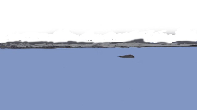
Good day. Today I would like to share with you a landscape rendering I did in Photoshop CS5. The image is a representation of what I am hoping will be the type of views I find on my upcoming trip to Alaska. To start I put down a large block of colour to start the base layer of my water.

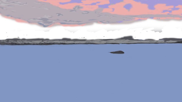
Next I started filling in the shoreline and put a lone boulder in the water to help add some depth.
Ok, things down here are progressing well so next I started on the sky and clouds.
Starting to really look good and I've managed to keep my brush stokes fairly loose with no outlines. Next we need some mountains.

So with everything starting to fill in I only have a couple more elements to add. Snow capped peaks, a tree line and some clouds coming through the mountain passes.

Ok, looking good. But the water needs something. How about some reflections of the clouds.
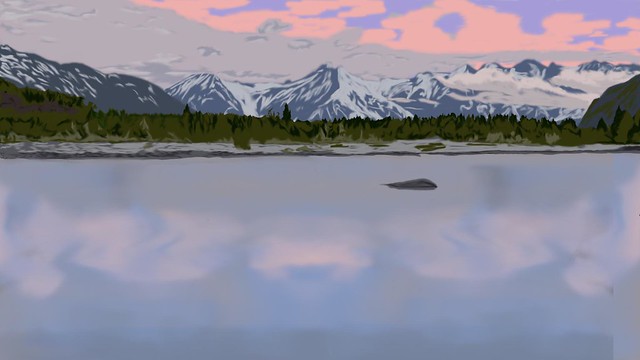
Not bad for a loose technique. I hope you like it. I will post more landscapes soon and watch for my photo sets from Alaska coming soon.
Next I started filling in the shoreline and put a lone boulder in the water to help add some depth.
Ok, things down here are progressing well so next I started on the sky and clouds.
Starting to really look good and I've managed to keep my brush stokes fairly loose with no outlines. Next we need some mountains.
So with everything starting to fill in I only have a couple more elements to add. Snow capped peaks, a tree line and some clouds coming through the mountain passes.
Ok, looking good. But the water needs something. How about some reflections of the clouds.
Not bad for a loose technique. I hope you like it. I will post more landscapes soon and watch for my photo sets from Alaska coming soon.
Friday, April 13, 2012
Missing Links
Good day, I'm not sure what happened with my last post? The images were there for a day and then they vanished. So I'm just going to repost them here before I carry on with a new post.
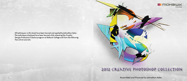
This is the cover.
This is the first page image.
This is the second page.

This is the third page.
This is the fourth page.
This is the fifth page.

And this is the sixth and final page of my 2012 Creative Photoshop book. Sorry again for the previous post.
This is the cover.
This is the first page image.
This is the second page.
This is the third page.
This is the fourth page.
This is the fifth page.
And this is the sixth and final page of my 2012 Creative Photoshop book. Sorry again for the previous post.
Tuesday, April 3, 2012
Hello fellow bloggers. With only three weeks left until graduation projects are coming to completion and I just wanted to share with you some of what has been keeping me up at night.
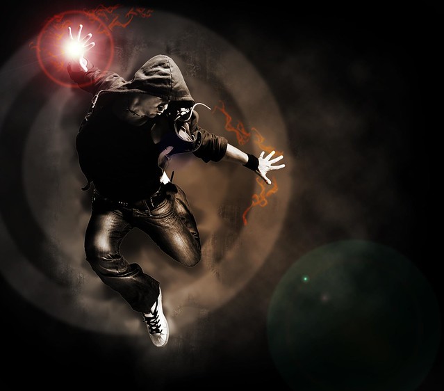
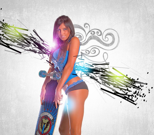
These are the final pages for my 2012 Creative Photoshop Collection booklet. The first page of the booklet is a technique I learned from www.psd.tutsplus.com. This tutorial is about adding flames to an athlete while in motion. The tutorial used a snowboarder.

What I really liked about this was the background. Yes the flames are cool but I have brushes in photoshop that do the same thing. I wanted the capture the gritty feeling of this image. I've had a stock image in my library of a male hip-hop dancer in this interesting jumping position for sometime now and felt he would work great with this technique.

As you can see I made the image a bit more gritty by applying some more texture to the back ground. I did add some flames but only very minor as compared to the tutorial. To finish off this technique I used the flare tool to add a power point to his hand giving the image a bit of an aggressive feel. Next we will look at the second page of the booklet .
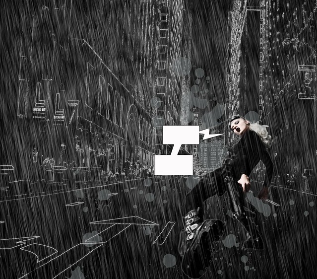
For this page I got back to my comic book roots and attempted a technique with a Sin City kinda feel to it. I found this technique at anothera.net. The nice thing about this tutorial is that they provided a video.
Although I used my own images, I didn't really deviate from this tutorial. This style has a very specific feel to it and I wanted to not lose it.

The rain proved to be a bit of a challenge and I still feel it might be a bit overpowering but it was a good time working on it.
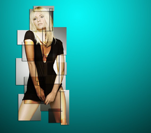
Here is where I made some changes to the content in my book. Originally my third page was going to be a displacement technique that I applied to a beautiful latin model. The technique worked fine.

But this image just didn't have the same feel that the rest of the book was developing. I wanted to keep going with a more abstract/gritty feel. So, I got looking around and I found this decomposed – abstract technique on psdbox.com.

Unfortunately, I was unable to find a suitable male model to replace this guy (if any ladies out there know where to get good quality images of CLOTHED male models please send me a link) so I ended up using the same model and altered the technique. I decided to do some abstract pieces to tie everything into the abstract typography piece I did for the cover, which I have shared in a previous post. There really is not a set formula for a technique like this you kinda just throw stuff down and get what you get.
As you can see I got a lot more aggressive with things. I also added a texture to the background to help tie this page into the next piece as they are the center splash of the book.
Which brings us to the next page.This page features a stylish lighting effect that I found on abduzeedo.com.

Once again it was the bright abstract feel that attracted me to this technique. I used a different model and added some extra elements but pretty much followed this tutorial to it's design.

As you can see the background texture is the same for this page as well as the last and I hope they marry up nicely together in the book. With only a couple of pages left I wanted to show a couple of refined techniques and the next one I learned in class here at Mohawk College. It's a multi-coloured box design that has a slightly abstract element to it.
When I applied this technique I used an image that had a more vibrant feel to it. and once I was finished the technique I added a brighter background to help the image fit into the booklet for the fifth page.

I like the look of this technique on a model with clean lines but if you want to see this technique done with some more attitude you have to check out Jefferson Ceballos rendering of this technique. (He hasn't posted it yet but has assured me it will be up soon.)
For the final page I got completely away from the abstract theme I had going but I absolutely love the look of this technique. I came across this next technique at photoshopstar.com, and being a penciler at heart I had to give it a go. There really wasn't much to this technique (surprisingly) and it has a nice elegant feel.
For the final page I got completely away from the abstract theme I had going but I absolutely love the look of this technique. I came across this next technique at photoshopstar.com, and being a penciler at heart I had to give it a go. There really wasn't much to this technique (surprisingly) and it has a nice elegant feel.
So there you have a full preview of my 2012 Creative Photoshop Collection book, hope you like it and I can't wait to see it printed.
Cheers
Tuesday, March 13, 2012
Emotional Labour
"Emotional Labour," as defined by Seth Godin in a podcast by Spark 97, is to do the difficult work that others are not willing to do. That the act of connecting with another human being and making a change even when it is not easy to facilitate at the time...
Seth Godin is talking about the individual who is willing to take the initiative, give his/her ideas away for free so that he/she can get their ideas out there. This is because if your ideas are not out there then no one knows about them and they are worthless. Seth also talks about attention being the most precious thing that anyone should strive for, because having someone pay attention to you is the only way to get your ideas out there.
Not many people can explain or say this better than Seth Godin, and I'm not trying to either. I'm just hoping that by sharing with you the what, who's, and how's of my experiences I will be able to inspire some of you to put your ideas out there and get the attention you deserve.
Emotional labour for me is not just about getting my work or ideas noticed, but helping my children express and achieve their ideas. Weather it's in karate, gymnastics or trying to organize a club (Aavery has had a drawing club in previous years, this year it's basketball). I take great pride putting in the "Emotional Labour," to help them see their ideas come to fruition.
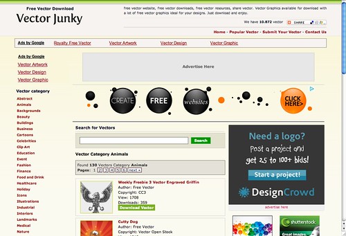
An example of someone giving something away for free that I have come across is a website devoted to providing royalty/licence free vector images is Vector Junky. On their website you can find just about anything you can think of, and other than having to wait 60 sec's in between downloads they don't ask for much. Yes there are ads on the site and they have a second section of graphics that are from Shutterstock (which is a pay site), you don't have to look at these.
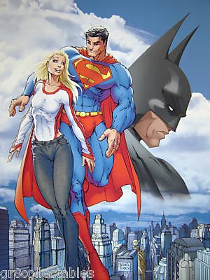
A website I like to look in on that I feel is truly an Emotional Labour for those who run it is a memorial site for Micheal Turner. Micheal Turner was a comic book artist who got his start drawing backgrounds. That's it, just the backgrounds weather a city scape, land scape, or the inside of a secret hideout that's what he did. Eventually he gained recognition and went on to draw characters such as Supergirl, Batman, Superman,
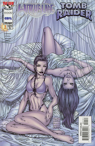
Then he moved on to work on Witchblade and Tombraider.
After achieving some good success with these characters he went on to develop his own character Aspen for his own title Fathom.

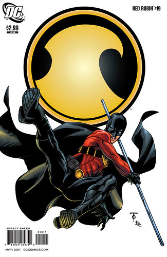
This led him to launching his own company Aspen Comics. The guys at Aspen Comics carry on and it was here that I found the next person I would like to introduce you to, Marcus To.
Marcus, is good at doing Emotional Labour as well, by sharing sneak peaks of his current or upcoming work. I love checking his twitter feed to see what he is working on.
https://twitter.com/#!/marcusto
There you have it, I hope that by me sharing these websites and artists I have been able to change your mind about weather or not to put yourself out there for everyone to see. I made the leap, here, and I hope that you well enjoy looking through my blogs as much as I am having bring them to you.
Seth Godin is talking about the individual who is willing to take the initiative, give his/her ideas away for free so that he/she can get their ideas out there. This is because if your ideas are not out there then no one knows about them and they are worthless. Seth also talks about attention being the most precious thing that anyone should strive for, because having someone pay attention to you is the only way to get your ideas out there.
Not many people can explain or say this better than Seth Godin, and I'm not trying to either. I'm just hoping that by sharing with you the what, who's, and how's of my experiences I will be able to inspire some of you to put your ideas out there and get the attention you deserve.
Emotional labour for me is not just about getting my work or ideas noticed, but helping my children express and achieve their ideas. Weather it's in karate, gymnastics or trying to organize a club (Aavery has had a drawing club in previous years, this year it's basketball). I take great pride putting in the "Emotional Labour," to help them see their ideas come to fruition.
An example of someone giving something away for free that I have come across is a website devoted to providing royalty/licence free vector images is Vector Junky. On their website you can find just about anything you can think of, and other than having to wait 60 sec's in between downloads they don't ask for much. Yes there are ads on the site and they have a second section of graphics that are from Shutterstock (which is a pay site), you don't have to look at these.
A website I like to look in on that I feel is truly an Emotional Labour for those who run it is a memorial site for Micheal Turner. Micheal Turner was a comic book artist who got his start drawing backgrounds. That's it, just the backgrounds weather a city scape, land scape, or the inside of a secret hideout that's what he did. Eventually he gained recognition and went on to draw characters such as Supergirl, Batman, Superman,
Then he moved on to work on Witchblade and Tombraider.
After achieving some good success with these characters he went on to develop his own character Aspen for his own title Fathom.
This led him to launching his own company Aspen Comics. The guys at Aspen Comics carry on and it was here that I found the next person I would like to introduce you to, Marcus To.
Marcus, is good at doing Emotional Labour as well, by sharing sneak peaks of his current or upcoming work. I love checking his twitter feed to see what he is working on.
https://twitter.com/#!/marcusto
There you have it, I hope that by me sharing these websites and artists I have been able to change your mind about weather or not to put yourself out there for everyone to see. I made the leap, here, and I hope that you well enjoy looking through my blogs as much as I am having bring them to you.
Tuesday, March 6, 2012
Creative Photoshop Book pages
So most of my time has been spent preparing the cover and some pages for my Creative Photoshop book. For my cover I went with a typographic abstract image. I learned this technique from www.digitalartsonline.co.uk.

As I complete the various pages I will be posting them, so far I have two pages done. These will be pages 7 and 8 in my book. Page 7 is a technique learned while attending Mohawk College's graphic design program.

Page 8 is a displacement technique I found online at www.computerarts.co.uk.

Well, that's what I have so far and I will endeavor to bring you more creative photoshop techniques as I learn, practice and complete them.
As I complete the various pages I will be posting them, so far I have two pages done. These will be pages 7 and 8 in my book. Page 7 is a technique learned while attending Mohawk College's graphic design program.
Page 8 is a displacement technique I found online at www.computerarts.co.uk.
Well, that's what I have so far and I will endeavor to bring you more creative photoshop techniques as I learn, practice and complete them.
Catching up
Good day all. I've been playing catchup lately and I just wanted to share with you some of the illustrations and other projects that have been occupying my time. Or what time I've been able to squeeze from the gymnastic/karate schedule.
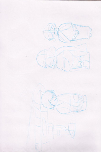
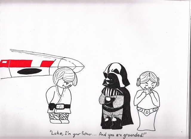
I'm going to start with an illustration I had in the back of my head for our first Illustration Friday word "grounded." Having children and the constant influence of cartoons, books and toys. Any parent out there knows what I'm talking about. Back to the illustration, grounded can mean many things but two that stuck out to me was a plane being grounded (not aloud to take off) and a child being grounded for misbehaving. So I thought it would make for a humorous scene if Darth Vader was grounding Luke Skywalker from flying his X-wing.
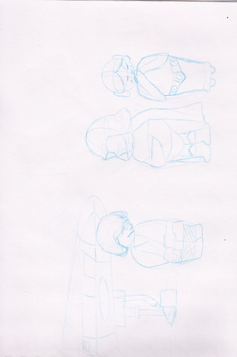
For this illustration I decided I wanted to finish with ink so I started my basic shapes with a non-photo blue pencil.
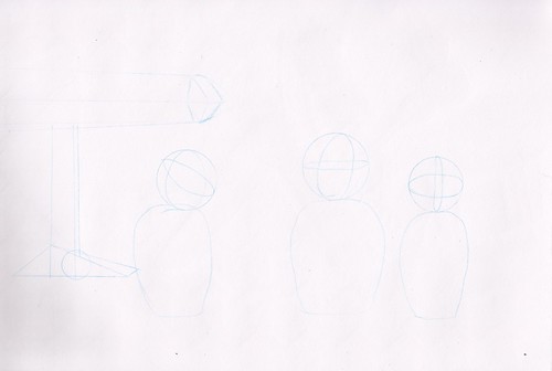
From here I continued in the non-photo pencil to fill in my rough lines.
Once I had my rough lines in started to fill in with black ink. Once the black ink was complete I felt the illustration needed something to make it pop so I added some red ink to the X-wing in the background. I also put Leah in the illustration to hint that it was she who got Luke in trouble.

I'm going to start with an illustration I had in the back of my head for our first Illustration Friday word "grounded." Having children and the constant influence of cartoons, books and toys. Any parent out there knows what I'm talking about. Back to the illustration, grounded can mean many things but two that stuck out to me was a plane being grounded (not aloud to take off) and a child being grounded for misbehaving. So I thought it would make for a humorous scene if Darth Vader was grounding Luke Skywalker from flying his X-wing.
For this illustration I decided I wanted to finish with ink so I started my basic shapes with a non-photo blue pencil.
From here I continued in the non-photo pencil to fill in my rough lines.
Once I had my rough lines in started to fill in with black ink. Once the black ink was complete I felt the illustration needed something to make it pop so I added some red ink to the X-wing in the background. I also put Leah in the illustration to hint that it was she who got Luke in trouble.
Subscribe to:
Posts (Atom)