Wednesday, February 15, 2012

IWD Poster Update

As time draws to a close and IWD (International Women's Day) fast approaches I wanted to take this time to share the progress of my poster thus far.

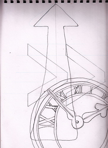
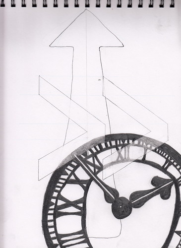
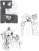
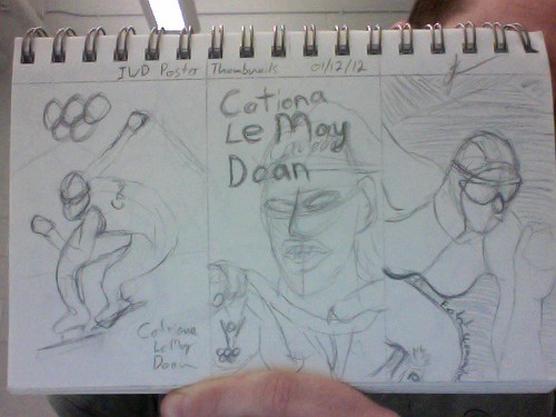
Firstly, here is a look at the paint stage with larger areas of colour filled in with not much detail to it yet.

work in progress

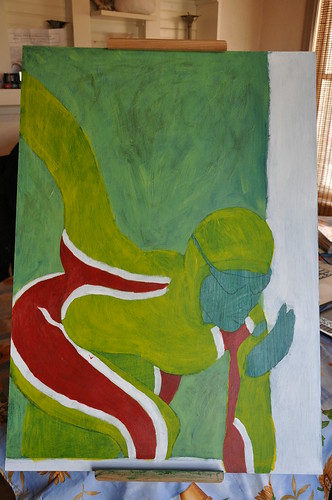
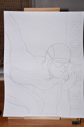
I am planning on staying with a very graphical, solid blocks of colour style, while trying to capture a sports poster feel to it. To accomplish this you can see I have used a white boarder or frame area on the bottom and right side. You can also see that I have my subject breaking through that boarder to help empathise her movement and create a little visual tension.

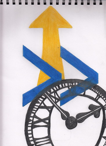
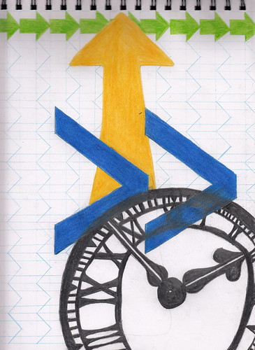
As I have progressed I have added minor details and some type elements.

Type done

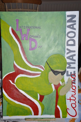
As I continued to paint I have gone back and forth with just how much detail to put into her facial features and after many, many long hours of debate (not so easy with only one debater), I have decided to not add detail to her. Adding to much detail to just this one part of the painting I feel will take away from my over all look I am trying to reach.

For the type elements I know I had the option to leave these areas blank and add them in digitally during post production but this is what I always do. So, I decided to paint them in. More to challenge myself to step out of my digital comfort zone than for any other reasons. All in all, I like what I have done and I'm glad I did take the digital easy way.

All that is left is to finish it off with.... well that's for another post. I can't give everything away.
Cheers.

Monday, February 6, 2012

Good day, I have been working on an Illustration Friday piece for the word "forward." For this piece I decided to take a more graphic approach. All most all of the elements are comprised of basic shapes with the exception of the clock face.
When I started the first thing that came to me was time, time is always moving forward. So my first element was the clock face. I didn't was just a digital or watch style face so I looked to clock towers to use in my illustration. With the clock face figured out I wanted to explore other every day symbols we see that tell us to move forward. The yellow arrows painted on the roads  was my next element followed by the fast forward button arrows. Which brings us to the first step of the design, rough line work.

forward step 1

As the clock face was the first thing to come to me I wanted it to be the stand out element. To accomplish this I made it my darkest element and used 6B graphite to colour it in.

forward step 2

At this point I realized that I didn't want the clock face to be covering all of the other elements in the design so I took a needable eraser and pulled off a layer of the graphite where the fast forward arrows intersected with the clock. Then I started to add some colour to my shapes.

forward step 3

For my colour scheme I decided to use the yellow for the road arrow and a blue for the fast forward arrows so that I could combine the two to use green for my back ground element.

forward step 4

For my back ground element I wanted to use a repeating green arrow because direction signs all over the world use the green arrow to tell which way we should proceed forward. The fun part of this is that by measuring out the arrows so that they are uniform in both size and spacing once the final rendering is complete we will be able to see a contrast to the theme of the design which is "forward," as the negative space in the background design will form into a repeating arrow the same size and spacing as the green arrows that is moving in the opposite direction. Which I feel compliments the over all design of the finished piece for "forward."

forward finished

Friday, February 3, 2012

Awesome wake boarding in Alaska

Good evening all. An interest of my is traveling and I am stoked about an up coming trip to Alaska. Yes, that's right number two on my all time places to visit (the first is the Arctic). As I have been doing some research on where to go and what to see I've stumbled across this video of Andy Hurdman wake boarding in Alaska by Team Hydrus & Up Down Procutions. It's a short video so I hope you take the time to watch it. It's pretty awesome.


Alaska Wakeboarding Teaser from Catchin' Air Tv Show from UpDown Productions on Vimeo.

Tuesday, January 24, 2012

Illustration Friday, Prepare

Here is an update to my prepare piece for Illustration Friday.


prepare
Just the detail work left and red hi-light.

Sunday, January 22, 2012

New Scanner

I got a new scanner today, sooooo exciting =D I spent the better part of tonight scanning & uploading a good chunk of my illustrations. There is a variety of subject matter and some different mediums. You will see some pieces that look unfinished but this is the way I tend to work. Having three or four illustrations on the go allows me to move from one illustration to another as I hit creative blocks. I've made two sets for my work sketch book drawings and past illustrations that I have finished. Like I said I'm excited to be able to get more of my illustrations posted for everyone to see.


sketch book crushed popcan 2009
This image will bring you to my sketch book set.


acriylic ad1 2010
This image will bring you to my past illus. set.

Have a look. Inside these sets you will see characters from various comics, please don't leave comments citing copy write or trade make restrictions. These are simply fan art.

Tuesday, January 17, 2012

Good day everyone. I'm taking part in the Illustration Friday word of the week illustrations and I just wanted to share with you my thumbnails for this weeks word, "prepared."
  prepared-thumbs

In my first thumbnail I'm going for a kind of noir feel with my subject entering a dark motel room and gearing up with supplies off a table. I might use 1 colour as an accent, the source of which will be the motel sign outside the window.

In my second thumbnail I might try to keep a dark feel to it and I would be addressing the fear one has upon graduating and having to head out into the working world. To accomplish this my subject has his/her back to us and he/she is looking out over a sea of zombie like employers.

And for my last thumbnail I was inspired while watching tv with my son and I was thinking of doing a group shot of DC comics Young Justice team. Have a look and please feel free to weigh in, I appreciate criticisms.


Ok, here's an update on my progress. I've decided to go with my concept from thumbnail number one. I'm drawing some inspiration from this illustration from a 1953 Adventure Magazine illustration found in Leif Peng's Flickr archives of mid-20th century illustrations. I For this illustration I'm working digitally in Photoshop's CS4, and I hoping to use a three panel comic set up with some overlapping elements to try and catch a gritty noir feel. At this stage I've got my frames laid out and some rough lines.


prepare-rough lines

I hope everyone had a good thursday. I've got the next stage of my illustration for you all to look at. I started in the first frame and so far it's mostly been blacking out the room trying to get that gritty feel to it.


prepare - stage 1

Monday, January 16, 2012

IWD poster next step

Ok, the next step in my creative design process is to look into some graphic art by Al Parker to try to find something in his work weather it's composition, colour usage or something else that stands out to me. Then I will share my thumbnails and narrow down a direction to keep developing.

The Al Parker image that I've chosen to gather some inspiration from is from his Cosmopolitan,  1952 illustration. Have a look. You can view a more complete collection of Al Parker's fabulous illustrations at http://www.flickr.com/photos/leifpeng/sets/1502340/with/5638524454/

  Al Parker

 What I like about this illustration is how he used a flattened graphic colour scheme with moderate to little detail in his line art(or pen & ink, wish I could see the original artwork). It's this combination of techniques that I am going to try to draw upon for my poster. Which brings me to my thumbnails. Have a look and then we will talk about which direction I will explore and why.

  IWD thumbs

I started my thumbnail sketches roughing out both full body action scene and a portrait style scene. Both of which had aspects that appealed to me. I like when an illustration has some type of motion, or action to it but I all so really like the detail you can get from a portrait. So I decided for my third thumbnail to try capturing both the action & the detail from the first two thumbnails and discovered the possibility for some interesting type elements. Catriona has been called the "Fastest woman alive," which I think will run very nicely along the contour of her knee right up front in the fore ground.

So that's where I'm at now it's time to explore some colour concepts to go with my portrait in motion, hey I rather like that, and I will get my colour comps posted shortly for us to have a look. Until then, Cheers.

Good evening all. I have a good start on my to scale (18" x 24") pencil rendering. This size is too big to fit in my scanner so I have taken a photo of it, hop it is clear enough for you to see. As I continue working through this piece I will be trying some colour possibilities. Red and yellow for her suit with some white accent strips. not sure what I'll do for the background, yet.


IWD pencil rendering under way
Oh ya, once the painting is done I will most likely be using an india ink pen-brush to do some of the line details.  I'm really getting more of a skating event poster than I am for an IWD poster. Hopefully once I figure out the rest of the typography elements it will all come together.