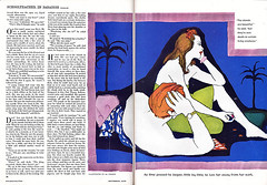
The Al Parker image that I've chosen to gather some inspiration from is from his Cosmopolitan, 1952 illustration. Have a look. You can view a more complete collection of Al Parker's fabulous illustrations at http://www.flickr.com/photos/leifpeng/sets/1502340/with/5638524454/

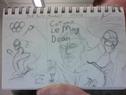
What I like about this illustration is how he used a flattened graphic colour scheme with moderate to little detail in his line art(or pen & ink, wish I could see the original artwork). It's this combination of techniques that I am going to try to draw upon for my poster. Which brings me to my thumbnails. Have a look and then we will talk about which direction I will explore and why.

I started my thumbnail sketches roughing out both full body action scene and a portrait style scene. Both of which had aspects that appealed to me. I like when an illustration has some type of motion, or action to it but I all so really like the detail you can get from a portrait. So I decided for my third thumbnail to try capturing both the action & the detail from the first two thumbnails and discovered the possibility for some interesting type elements. Catriona has been called the "Fastest woman alive," which I think will run very nicely along the contour of her knee right up front in the fore ground.
So that's where I'm at now it's time to explore some colour concepts to go with my portrait in motion, hey I rather like that, and I will get my colour comps posted shortly for us to have a look. Until then, Cheers.
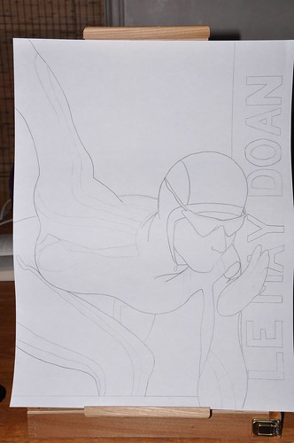
Good evening all. I have a good start on my to scale (18" x 24") pencil rendering. This size is too big to fit in my scanner so I have taken a photo of it, hop it is clear enough for you to see. As I continue working through this piece I will be trying some colour possibilities. Red and yellow for her suit with some white accent strips. not sure what I'll do for the background, yet.

Oh ya, once the painting is done I will most likely be using an india ink pen-brush to do some of the line details. I'm really getting more of a skating event poster than I am for an IWD poster. Hopefully once I figure out the rest of the typography elements it will all come together.

Some good potential in these thumbnails, John. I really like the interesting cropping you used on the one on the right, as well as the way you're indicating type wrapping along the contour of her leg. Make sure you've figured out ALL the type elements before Monday's class! Right now your thumbnails don't indicate how you intend to design everything into one complete composition. You can develop this further in your colour scheme explorations as well. Looking good, buddy!
ReplyDelete