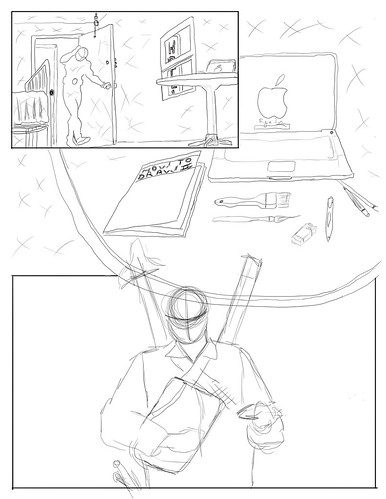
In my first thumbnail I'm going for a kind of noir feel with my subject entering a dark motel room and gearing up with supplies off a table. I might use 1 colour as an accent, the source of which will be the motel sign outside the window.
In my second thumbnail I might try to keep a dark feel to it and I would be addressing the fear one has upon graduating and having to head out into the working world. To accomplish this my subject has his/her back to us and he/she is looking out over a sea of zombie like employers.
And for my last thumbnail I was inspired while watching tv with my son and I was thinking of doing a group shot of DC comics Young Justice team. Have a look and please feel free to weigh in, I appreciate criticisms.
Ok, here's an update on my progress. I've decided to go with my concept from thumbnail number one. I'm drawing some inspiration from this illustration from a 1953 Adventure Magazine illustration found in Leif Peng's Flickr archives of mid-20th century illustrations. I For this illustration I'm working digitally in Photoshop's CS4, and I hoping to use a three panel comic set up with some overlapping elements to try and catch a gritty noir feel. At this stage I've got my frames laid out and some rough lines.

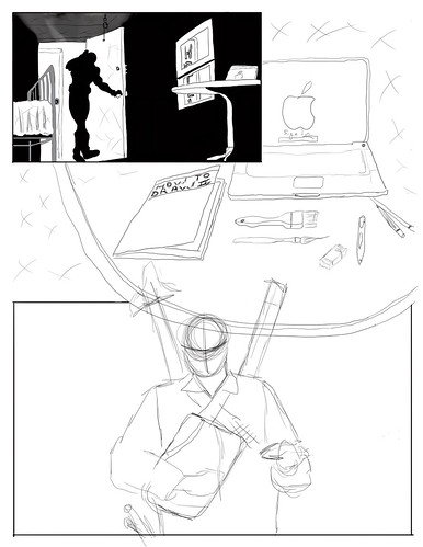
I hope everyone had a good thursday. I've got the next stage of my illustration for you all to look at. I started in the first frame and so far it's mostly been blacking out the room trying to get that gritty feel to it.


Good thought process and a nice start to the execution of the piece. I'm very interested in seeing where you go with this, John.
ReplyDelete